Nota
Haga clic aquí para descargar el código de ejemplo completo
Percentiles como gráfico de barras horizontales #
Los gráficos de barras son útiles para visualizar recuentos o estadísticas resumidas con barras de error. Consulte también el gráfico de barras agrupadas con etiquetas o el ejemplo de gráfico de barras horizontales para obtener versiones más simples de esas características.
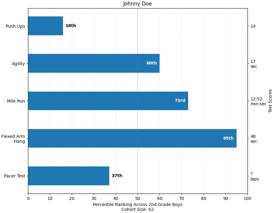
Este ejemplo proviene de una aplicación en la que los maestros de gimnasia de la escuela primaria querían poder mostrar a los padres cómo les fue a sus hijos en varias pruebas de aptitud y, lo que es más importante, en relación con el desempeño de otros niños. Para extraer el código de trazado con fines de demostración, inventaremos algunos datos para el pequeño Johnny Doe.
from collections import namedtuple
import numpy as np
import matplotlib.pyplot as plt


Student = namedtuple('Student', ['name', 'grade', 'gender'])
Score = namedtuple('Score', ['value', 'unit', 'percentile'])


def to_ordinal(num):
    """Convert an integer to an ordinal string, e.g. 2 -> '2nd'."""
    suffixes = {str(i): v
                for i, v in enumerate(['th', 'st', 'nd', 'rd', 'th',
                                       'th', 'th', 'th', 'th', 'th'])}
    v = str(num)
    # special case early teens
    if v in {'11', '12', '13'}:
        return v + 'th'
    return v + suffixes[v[-1]]


def format_score(score):
    """
    Create score labels for the right y-axis as the test name followed by the
    measurement unit (if any), split over two lines.
    """
    return f'{score.value}\n{score.unit}' if score.unit else str(score.value)


def plot_student_results(student, scores_by_test, cohort_size):
    fig, ax1 = plt.subplots(figsize=(9, 7), constrained_layout=True)
    fig.canvas.manager.set_window_title('Eldorado K-8 Fitness Chart')

    ax1.set_title(student.name)
    ax1.set_xlabel(
        'Percentile Ranking Across {grade} Grade {gender}s\n'
        'Cohort Size: {cohort_size}'.format(
            grade=to_ordinal(student.grade),
            gender=student.gender.title(),
            cohort_size=cohort_size))

    test_names = list(scores_by_test.keys())
    percentiles = [score.percentile for score in scores_by_test.values()]

    rects = ax1.barh(test_names, percentiles, align='center', height=0.5)
    # Partition the percentile values to be able to draw large numbers in
    # white within the bar, and small numbers in black outside the bar.
    large_percentiles = [to_ordinal(p) if p > 40 else '' for p in percentiles]
    small_percentiles = [to_ordinal(p) if p <= 40 else '' for p in percentiles]
    ax1.bar_label(rects, small_percentiles,
                  padding=5, color='black', fontweight='bold')
    ax1.bar_label(rects, large_percentiles,
                  padding=-32, color='white', fontweight='bold')

    ax1.set_xlim([0, 100])
    ax1.set_xticks([0, 10, 20, 30, 40, 50, 60, 70, 80, 90, 100])
    ax1.xaxis.grid(True, linestyle='--', which='major',
                   color='grey', alpha=.25)
    ax1.axvline(50, color='grey', alpha=0.25)  # median position

    # Set the right-hand Y-axis ticks and labels
    ax2 = ax1.twinx()
    # Set equal limits on both yaxis so that the ticks line up
    ax2.set_ylim(ax1.get_ylim())
    # Set the tick locations and labels
    ax2.set_yticks(
        np.arange(len(scores_by_test)),
        labels=[format_score(score) for score in scores_by_test.values()])

    ax2.set_ylabel('Test Scores')


student = Student(name='Johnny Doe', grade=2, gender='Boy')
scores_by_test = {
    'Pacer Test': Score(7, 'laps', percentile=37),
    'Flexed Arm\n Hang': Score(48, 'sec', percentile=95),
    'Mile Run': Score('12:52', 'min:sec', percentile=73),
    'Agility': Score(17, 'sec', percentile=60),
    'Push Ups': Score(14, '', percentile=16),
}

plot_student_results(student, scores_by_test, cohort_size=62)
plt.show()
Referencias
En este ejemplo se muestra el uso de las siguientes funciones, métodos, clases y módulos: