Nota
Haga clic aquí para descargar el código de ejemplo completo
Combinar transparencia con color en imágenes 2D #
Combine la transparencia con el color para resaltar partes de los datos con imshow.
Un uso común para matplotlib.pyplot.imshowes trazar un mapa estadístico 2D. La función facilita la visualización de una matriz 2D como una imagen y agrega transparencia a la salida. Por ejemplo, se puede trazar una estadística (como una estadística t) y colorear la transparencia de cada píxel según su valor p. Este ejemplo demuestra cómo puede lograr este efecto.
Primero generaremos algunos datos, en este caso, crearemos dos "manchas" 2D en una cuadrícula 2D. Un blob será positivo y el otro negativo.
import numpy as np
import matplotlib.pyplot as plt
from matplotlib.colors import Normalize
def normal_pdf(x, mean, var):
return np.exp(-(x - mean)**2 / (2*var))
# Generate the space in which the blobs will live
xmin, xmax, ymin, ymax = (0, 100, 0, 100)
n_bins = 100
xx = np.linspace(xmin, xmax, n_bins)
yy = np.linspace(ymin, ymax, n_bins)
# Generate the blobs. The range of the values is roughly -.0002 to .0002
means_high = [20, 50]
means_low = [50, 60]
var = [150, 200]
gauss_x_high = normal_pdf(xx, means_high[0], var[0])
gauss_y_high = normal_pdf(yy, means_high[1], var[0])
gauss_x_low = normal_pdf(xx, means_low[0], var[1])
gauss_y_low = normal_pdf(yy, means_low[1], var[1])
weights = (np.outer(gauss_y_high, gauss_x_high)
- np.outer(gauss_y_low, gauss_x_low))
# We'll also create a grey background into which the pixels will fade
greys = np.full((*weights.shape, 3), 70, dtype=np.uint8)
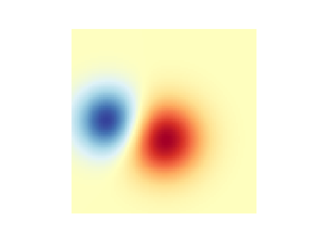
# First we'll plot these blobs using ``imshow`` without transparency.
vmax = np.abs(weights).max()
imshow_kwargs = {
'vmax': vmax,
'vmin': -vmax,
'cmap': 'RdYlBu',
'extent': (xmin, xmax, ymin, ymax),
}
fig, ax = plt.subplots()
ax.imshow(greys)
ax.imshow(weights, **imshow_kwargs)
ax.set_axis_off()
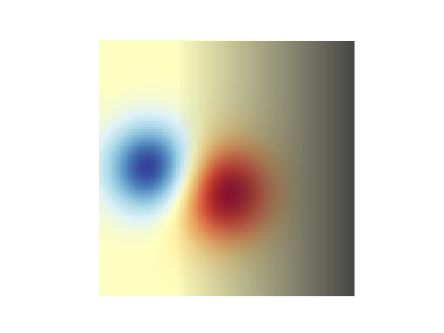
Fusión en transparencia #
La forma más sencilla de incluir transparencia al trazar datos
matplotlib.pyplot.imshowes pasar una matriz que coincida con la forma de los datos con el alphaargumento. Por ejemplo, crearemos un degradado moviéndose de izquierda a derecha debajo.
# Create an alpha channel of linearly increasing values moving to the right.
alphas = np.ones(weights.shape)
alphas[:, 30:] = np.linspace(1, 0, 70)

# Create the figure and image
# Note that the absolute values may be slightly different
fig, ax = plt.subplots()
ax.imshow(greys)
ax.imshow(weights, alpha=alphas, **imshow_kwargs)
ax.set_axis_off()
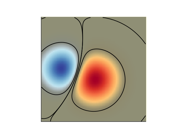
Uso de transparencia para resaltar valores con gran amplitud #
Finalmente, recrearemos la misma gráfica, pero esta vez usaremos transparencia para resaltar los valores extremos en los datos. Esto se usa a menudo para resaltar puntos de datos con valores p más pequeños. También agregaremos líneas de contorno para resaltar los valores de la imagen.
# Create an alpha channel based on weight values
# Any value whose absolute value is > .0001 will have zero transparency
alphas = Normalize(0, .3, clip=True)(np.abs(weights))
alphas = np.clip(alphas, .4, 1)  # alpha value clipped at the bottom at .4

# Create the figure and image
# Note that the absolute values may be slightly different
fig, ax = plt.subplots()
ax.imshow(greys)
ax.imshow(weights, alpha=alphas, **imshow_kwargs)

# Add contour lines to further highlight different levels.
ax.contour(weights[::-1], levels=[-.1, .1], colors='k', linestyles='-')
ax.set_axis_off()
plt.show()

ax.contour(weights[::-1], levels=[-.0001, .0001], colors='k', linestyles='-')
ax.set_axis_off()
plt.show()
Referencias
En este ejemplo se muestra el uso de las siguientes funciones, métodos, clases y módulos: